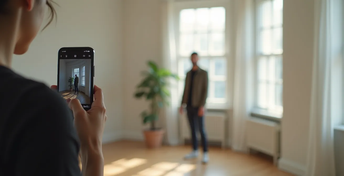
The secret to professional iPhone portraits isn’t a better camera; it’s developing your artistic intent.
- Mastering natural light and composition has a greater impact on quality than any app or feature.
- A professional workflow involves deliberate choices in shooting, editing, and curating your best work.
Recommendation: Stop chasing gear and start practicing the intentional techniques outlined in this guide to transform your mobile photography.
If you’ve ever felt the frustration of taking a portrait with your iPhone that looks flat, blurry, or just… amateur, you’re not alone. The common advice is a chorus of familiar refrains: “use Portrait mode,” “find good light,” or “download this editing app.” While these tips have their place, they often miss the fundamental element that separates a simple snapshot from a breathtaking portrait: artistic intent. The belief that you need a $2000 camera to achieve professional results is the biggest myth in modern photography.
This guide pushes past the superficial settings. We won’t just tell you *what* to do; we’ll explore the *why* behind each decision. We will treat your iPhone not as a point-and-shoot device, but as a serious artistic tool capable of incredible depth and emotion. The real magic happens when you learn to sculpt with light, compose with purpose, and edit with a clear vision. It’s about making deliberate choices to tell a story within a single frame.
But if the key isn’t the gear, what is it? The answer lies in a series of conscious decisions that begin long before you tap the shutter button and continue long after. It’s about understanding how a simple shift in composition can change the entire mood of a photo, or how a specific editing workflow can create a timeless “digital patina” on your images. This article will walk you through this professional mindset, giving you the strategies to elevate your iPhone portraits from ordinary to extraordinary.
To guide you on this artistic journey, we’ve structured this article to cover the critical pillars of mobile portraiture. From mastering the nuances of light to developing a ruthless culling strategy, each section builds upon the last, providing a complete framework for creating work you’ll be proud of.
Summary: Your Roadmap to Professional iPhone Portraits
- Natural Light vs Ring Light: Which Flattens the Face Less?
- The Rule of Thirds vs Center Framing: When to Break the Rules?
- Lightroom Mobile vs Snapseed: Which App Preserves Image Quality?
- The Smudge That Ruins 50% of Smartphone Photos
- When to Delete: The “Keep 1 in 10” Rule for Digital Hoarders
- The Leather Conditioner Mistake That Darkens Vintage Patina Irreversibly
- Photography or Journaling: Which Memory Keeping Method Keeps You Present?
- How to Achieve a “Glass Skin” Look Using Only 3 Products?
Natural Light vs Ring Light: Which Flattens the Face Less?
The single most important element in portraiture is light. While ring lights are popular for their convenience, they often produce a flat, one-dimensional look that eliminates the subtle shadows defining a person’s features. Natural light is the gold standard because it creates depth, dimension, and mood. The goal isn’t just to illuminate your subject, but to sculpt their face with a delicate interplay of light and shadow. A ring light floods the face, while window light wraps around it.
The key is to understand that “good light” is rarely direct, harsh sunlight. The most flattering natural light is soft and diffused. This is the kind of light you find near a north-facing window, under the shade of a large tree, or during the “golden hour” just after sunrise or before sunset. According to professional workflows, the secret is positioning your subject to explore different shadow effects, using the direction of the light to create a specific mood. This is not a passive act of finding light, but an active process of shaping your portrait with it.
By learning to see and manipulate natural light, you move from simply documenting a face to creating an evocative and professional-looking portrait. It costs nothing and has a more profound impact on your final image than any piece of equipment you could buy.
Your Action Plan: Master Natural Light for iPhone Portraits
- Positioning: Place your subject 2-3 feet from a north-facing window for soft, even illumination.
- Fill Light: Use a simple white foam core board or a reflector held opposite the window to gently fill in shadows on the other side of the face.
- Exposure Lock: Tap and hold on the brightest part of your subject’s face (but not a direct highlight) to lock the exposure (AE/AF Lock), preventing the iPhone from overexposing their skin.
- Timing: Whenever possible, shoot during the golden hour—the first hour after sunrise or the last hour before sunset—for warm, cinematic tones.
- Diffusion: If direct sunlight is unavoidable, use sheer curtains or a thin white sheet as a natural diffuser to soften its harshness.
The Rule of Thirds vs Center Framing: When to Break the Rules?
Composition is the silent language of photography. How you arrange elements within your frame dictates the story and emotional impact of your portrait. The “Rule of Thirds” is often the first compositional guideline photographers learn, suggesting you place your subject off-center for a more dynamic feel. While effective, treating it as an unbreakable law stifles creativity. True artistry lies in choosing the right composition for the intended emotion, which sometimes means breaking the rules entirely.
Center framing, for instance, can be incredibly powerful. Placing a subject directly in the middle of the frame creates a confrontational, direct, and stable feeling, perfect for formal headshots where you want the viewer’s full attention on the subject’s eyes. Conversely, using extreme negative space—placing your subject in a small portion of the frame—can evoke feelings of isolation, peace, or contemplation. The choice between these styles is a conscious act of storytelling.
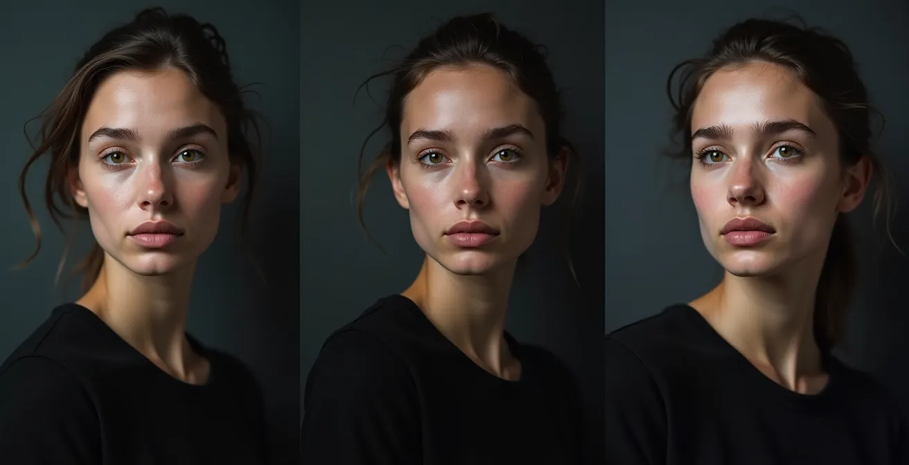
As the visual comparison shows, the same subject can convey vastly different moods based solely on composition. The question is not “Which rule is best?” but “Which composition best serves the story I want to tell?” Your iPhone’s camera grid (enable it in Settings) is a tool, not a mandate. Use it to learn the rules so you can break them with intention.
| Composition Style | Emotional Impact | Best Use Case | iPhone Tip |
|---|---|---|---|
| Rule of Thirds | Dynamic, narrative-driven | Environmental portraits | Enable grid in Camera settings |
| Center Framing | Confrontational, powerful | Headshots, formal portraits | Use Portrait mode focus lock |
| Negative Space | Isolation, contemplative | Artistic, editorial work | Shoot wider, crop in post |
Lightroom Mobile vs Snapseed: Which App Preserves Image Quality?
Once you’ve captured your image, the creative process moves into editing. The mobile editing landscape is vast, but two apps consistently stand out: Adobe Lightroom Mobile and Google’s Snapseed. The debate isn’t about which one is “better,” but how they fit into a professional workflow. In fact, many professional mobile photographers don’t choose one over the other. Industry surveys confirm that 87% of professional mobile photographers use both Lightroom Mobile and Snapseed in their workflow, leveraging the unique strengths of each.
Snapseed excels at precise, localized adjustments. Its “Selective” tool is unparalleled for brightening a specific area, and its “Healing” brush is perfect for removing small blemishes or distractions with a simple swipe. It’s the digital scalpel for fine-tuning details. Lightroom Mobile, on the other hand, is the master of global adjustments, color grading, and workflow management. Its ability to create and apply presets, its superior color science, and its non-destructive editing (especially with RAW/DNG files) make it the hub of a professional process. The best approach is a hybrid one, using each app for what it does best.
A typical pro workflow might look like this:
- Start in Snapseed: Open the image to perform any healing or selective adjustments needed. Fix that distracting element in the background or slightly brighten the eyes.
- Export at Max Quality: Save a full-quality copy from Snapseed to your camera roll.
- Import to Lightroom: Bring the edited image into Lightroom for the final touches. This is where you’ll apply your signature color grade, adjust overall exposure and contrast, and manage your photo library.
This two-step process ensures you get the best of both worlds: the precise tools of Snapseed and the powerful color engine and management of Lightroom, all while preserving maximum image quality.
The Smudge That Ruins 50% of Smartphone Photos
It may sound laughably simple, but a smudged lens is the silent killer of countless potentially great iPhone photos. Your phone is constantly in your hands, in your pocket, and against your face, accumulating a layer of oil and dust on its tiny lens. This film acts like a cheap, blurry filter, reducing contrast, creating hazy flares, and making it impossible to achieve a sharp focus. Before every single shot, make it a non-negotiable habit to wipe your lens with a microfiber cloth.
However, the most destructive “smudge” isn’t physical; it’s digital. The number one mistake amateur photographers make is using the pinch-to-zoom feature. Digital zoom doesn’t actually zoom; it simply crops the image from the sensor and enlarges it, drastically reducing quality. A study of 1000 iPhone portraits revealed that switching to a ‘shoot wide, crop later’ methodology improved final image quality by 40%.
This concept extends to what can be called “attentional smudges”—distracting elements in the background that draw the eye away from your subject. A bright red fire hydrant, a photobombing stranger, or a messy pile of laundry can ruin an otherwise perfect portrait. A pro photographer’s eye is trained to see not just the subject, but the entire frame. Before you shoot, take a second to scan the background. Can you move your feet a few inches to the left to hide that distracting sign? Can you change your angle to get a cleaner background? Cleaning your composition is just as important as cleaning your lens.
When to Delete: The “Keep 1 in 10” Rule for Digital Hoarders
In the age of digital photography, it’s easy to take hundreds of photos in a single session. This leads to a common problem: a camera roll cluttered with thousands of near-duplicates, making it impossible to find your best work. The process of selecting your best images and deleting the rest—known as culling—is not a chore. Culling is the final, crucial step of the creative process. It’s an act of curation that defines your style and strengthens your portfolio.
A simple but effective guideline is the “Keep 1 in 10” rule. For every ten photos you take of a particular setup or pose, challenge yourself to keep only the absolute best one. This forces you to be critical and to identify what truly makes an image stand out. Is it the perfect expression? The best focus? The most compelling composition? This ruthless process helps you understand your own tendencies and improves your eye for detail.
As professional photographer Rachel Gulotta of Mango Street puts it, the objective is to find the gems, not just clear out the junk. Your final selection tells a story, and keeping mediocre shots only dilutes that narrative.
The goal is to find the gems, not just clear out junk.
– Rachel Gulotta, Mango Street
To make this process manageable, use a three-pass system. On the first pass, quickly swipe through and delete anything that is obviously flawed (blurry, bad expression, eyes closed). On the second pass, compare similar shots and “favorite” the strongest one in each group. On the final pass, review only your favorites and un-favorite any that no longer feel as strong. What remains is your curated selection, ready for editing.
The Leather Conditioner Mistake That Darkens Vintage Patina Irreversibly
In the world of vintage leather, the wrong conditioner can strip away years of beautiful, story-rich patina, replacing it with a flat, dark, and lifeless finish. The same principle applies to digital portraiture. A heavy-handed editing style, much like the wrong conditioner, can destroy the subtle textures and tones that give a portrait its soul. The goal is often not to create a hyper-realistic, sterile image, but to cultivate a “digital patina”—a sense of timelessness, texture, and warmth.
This “mistake” in iPhone photography is often the overuse of clarity, saturation, and sharpening sliders. Pushing them too far creates a harsh, artificial look that feels brittle and cheap. Creating an authentic digital patina is a more delicate process of subtraction and subtle addition. It involves techniques that mimic the pleasing imperfections of film photography, such as adding a fine layer of grain, gently “fading” the black tones for a softer feel, and shifting the color balance towards warmer, more nostalgic hues.
Achieving this look is about restraint. It’s about enhancing the existing texture of the skin and the quality of the light, not obliterating them. Here’s a simple workflow to create a tasteful digital patina in your edits:
- Emphasize Texture with Light: Before you even edit, use hard side-lighting during your shoot to naturally emphasize skin texture.
- Add Grain: In post-processing, add a subtle amount of grain (15-20% intensity) to break up the sterile digital smoothness.
- Lift the Blacks: Use the “Tone Curve” in Lightroom to slightly raise the bottom-left point. This “fades” the blacks, giving the image a softer, more vintage feel.
- Warm the Tones: Gently increase the “Temperature” slider (+5 to +10) to introduce a warm, sepia-like cast.
- Soften Selectively: Slightly reduce the “Clarity” or “Texture” slider (-5 to -10) to add a touch of softness without looking blurry.
Photography or Journaling: Which Memory Keeping Method Keeps You Present?
The question presents a false choice. For the intentional photographer, portraiture *is* a form of journaling. It’s a method of memory-keeping that, when done correctly, forces you to be deeply present in the moment. Instead of seeing a portrait session as a formal, posed event, reframing it as an act of visual journaling transforms your entire approach. The goal shifts from simply capturing a likeness to documenting an essence, a mood, or a fleeting moment of connection.
As the experts at iPhone Photography School suggest, this perspective changes the practice entirely. You’re no longer just a photographer; you are a chronicler of life.
iPhone Portraiture as Visual Journaling frames the practice not as formal sessions, but as a way to journal life.
– iPhone Photography School, Mobile Photography Techniques Guide
One of the most effective techniques for this is the “Interview Portrait.” Instead of asking your subject to “say cheese,” you engage them in a genuine conversation about something they are passionate about. Ask them about their work, their hobbies, their dreams. As they forget about the camera and become absorbed in their story, you will capture authentic micro-expressions and unguarded moments that a posed photo could never achieve. This method distracts the subject from the anxiety of being photographed and allows their true personality to shine through. The resulting images form a visual narrative, a “Day in the Life” series that holds far more meaning than a static headshot.
This approach keeps you, the photographer, intensely present. You must listen, watch, and anticipate. You are not just looking *at* your subject; you are connecting *with* them. The iPhone, with its small, unobtrusive form factor, is the perfect tool for this intimate style of visual journaling.
Key Takeaways
- Artistic intent is more important than your gear; deliberate choices in light and composition define a professional portrait.
- A hybrid editing workflow, using apps like Snapseed for details and Lightroom for color, yields the best results.
- Culling your photos is a critical act of curation that sharpens your eye and defines your personal style.
How to Achieve a “Glass Skin” Look Using Only 3 Products?
In the beauty world, “glass skin” refers to a complexion so luminous and clear it appears translucent. In photography, achieving this look has less to do with makeup and more to do with the masterful manipulation of light and editing. You don’t need an elaborate studio; you can create this coveted, dewy effect with just three “products”: a specific lighting setup, a precise camera technique, and a targeted post-processing adjustment.
The foundation of the glass skin look is incredibly soft, broad light. This is not the time for hard, directional light that creates deep shadows and emphasizes every bit of texture. You want a large, diffused light source, like a large window with a sheer curtain, positioned at a 45-degree angle to your subject. This wraps the face in a gentle glow, minimizing harsh textures and creating smooth gradations from light to shadow.
The second “product” is a camera technique: AE/AF Lock on the brightest highlight. When you are set up, tap and hold on the brightest, glossiest part of your subject’s face (like the top of the cheekbone) until the “AE/AF Lock” appears. This tells the iPhone to base its exposure on that bright point, ensuring the luminous highlights are perfectly exposed and not blown out, which is crucial for the “glassy” effect. Finally, in post-processing, you selectively enhance this effect. Instead of a global brightness increase, you use a selective tool to paint a small boost of brightness (+10-15%) only on the high points of the face, like the cheekbones, bridge of the nose, and forehead, to amplify the sheen.
| Aspect | Glass Skin Look | Natural Texture |
|---|---|---|
| Lighting | Soft, diffused, broad | Hard, directional |
| Clarity Setting | -20 to -30 | +15 to +25 |
| Highlights | +30 to +40 | 0 to -10 |
| Texture Slider | -15 to -20 | +20 to +30 |
Now that you’re armed with the mindset and techniques of a professional, the next step is simple: practice. Start by looking for light, not just subjects. See every shot as an entry in a visual journal. Be ruthless in your curation. The path to stunning portraits is paved with intention. Go create something beautiful.