In summary:
- Your paper is your foundation; using 300 GSM 100% cotton paper is the first step to preventing buckling and muddy washes.
- Luminous color comes from understanding pigment transparency and layering light, staining colors before heavier, granulating ones.
- Timing is everything. Use the “Sensory Clock” (visual sheen, tactile coldness) to know exactly when to add details for soft, controlled edges.
- Control “cauliflower” blooms by managing the water on your brush, using the “thirsty brush” technique to rescue overworked areas.
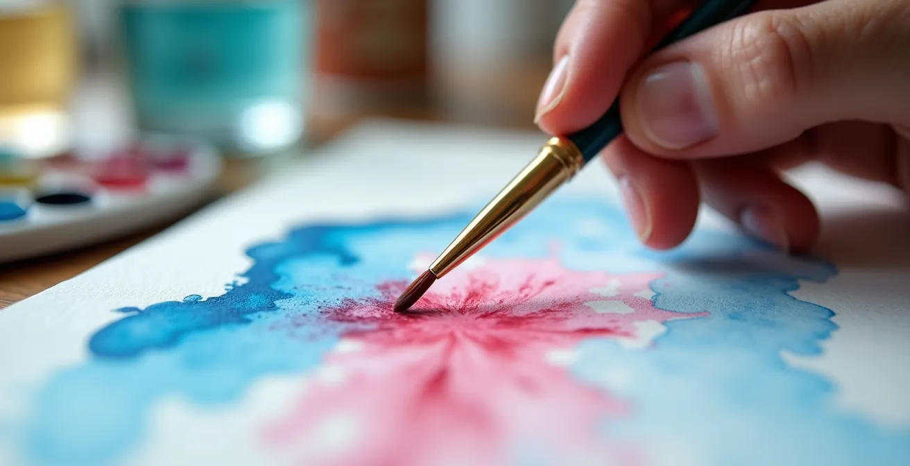
You’ve seen them: those ethereal watercolor paintings where colors flow into each other seamlessly, creating soft, atmospheric skies and dreamy landscapes. You grab your brush, load it with water and brilliant color, and touch it to the paper. But instead of a luminous glow, you get a frustrating, muddy puddle. The paper warps into a wavy mess, and your vibrant hues blend into a disappointing brown. You followed the tutorials, which all say “use plenty of water” and “layer light to dark,” but something is clearly missing.
The frustration is real and it’s the single biggest hurdle for aspiring watercolor artists. Many believe the secret lies in expensive brushes or a magical paint brand. Others get bogged down in complex color theory, memorizing wheels and charts without understanding the physical properties of their materials. These approaches miss the fundamental point of the wet-on-wet technique.
What if the secret to mastering wet-on-wet wasn’t a rigid rule, but a conversation? The key is to stop imposing your will on the paint and start a dialogue with the moisture on your paper. It’s about learning to read the sensory cues—the glistening sheen of a fresh wash, the cool dampness of a settling layer—to know precisely when to act. This isn’t about magic; it’s about understanding the physics of water, paper, and pigment.
This guide will walk you through that dialogue. We’ll explore why your paper choice is the foundation of everything, how to layer transparent colors for depth instead of mud, and how to use your senses to time every brushstroke perfectly. By the end, you’ll have a clear framework for turning those muddy messes into the luminous, expressive paintings you’ve always wanted to create.
To help you navigate this artistic journey, we’ve broken down the essential components of the wet-on-wet technique. This structured approach will guide you from the foundational materials to the final, expressive brushstrokes.
Summary: A Practical Guide to the Wet-on-Wet Watercolor Technique
- Why 300 GSM Cotton Paper Prevents Your Painting from Buckling?
- Transparency vs Opacity: How to Layer Colors specifically for Depth?
- When to Add Details: The “Cold to Touch” Paper Test
- The Water Control Error That Causes “Cauliflower” Blooms
- Natural vs Synthetic: Do You Really Need Sable Hair for Landscapes?
- Why the Tactile Feel of Watercolor Grounds Your Technique?
- Pans vs. Tubes: Which Paint Format Makes Wet-on-Wet Visuals Easier?
- How to Use Wet-on-Wet to Express Mood and Emotion (Not Just Mud)
Why 300 GSM Cotton Paper Prevents Your Painting from Buckling?
Before a single drop of paint is mixed, the success or failure of your wet-on-wet painting is decided by your paper. Beginners often choose thin, wood-pulp-based paper to save money, only to find it warps and buckles at the first touch of a wet brush. This isn’t a failure of technique; it’s a failure of materials. The paper is the stage for your watercolor performance, and a weak stage will collapse under pressure.
The key lies in two properties: weight and composition. The industry standard for professional work is 300 GSM (grams per square meter) or 140 lb paper. This thickness provides the necessary structural integrity to handle large amounts of water without turning into a wavy mess. However, weight alone isn’t enough. The real magic is in the material. High-quality watercolor paper is made from 100% cotton.
Unlike wood pulp, cotton fibers are longer, stronger, and more absorbent. They expand evenly when wet and shrink back to their original flat state as they dry. This inherent flexibility allows you to apply multiple washes, lift color, and work into the surface without it pilling or tearing. As explained in an analysis of how artists prevent paper buckling, cotton’s superior absorption ensures that paint settles into the fibers beautifully, resulting in more vibrant, luminous colors. Think of it as a durable sponge versus a paper towel; one holds its shape and releases water controllably, while the other disintegrates.
Investing in a small pad of 300 GSM, 100% cotton, cold-press paper is the single most impactful upgrade a beginner can make. It immediately eliminates the frustration of buckling and provides a stable, reliable surface, allowing you to focus on your technique rather than fighting your materials.
Transparency vs Opacity: How to Layer Colors specifically for Depth?
The dreaded “mud” is rarely a result of poor color mixing on the palette. It’s almost always caused by mixing incompatible pigment types directly on wet paper. To avoid this, you must understand the most important property of your watercolors: transparency. Unlike opaque mediums like acrylic or oil, watercolor’s beauty comes from light passing through the layers of paint, reflecting off the white paper, and bouncing back to your eye. When you layer opaque pigments over transparent ones in a wet wash, you block this light, creating a dull, lifeless effect we call mud.
The rule is simple: layer transparently. To build depth, you should start your wet-on-wet wash with staining, highly transparent pigments. These colors, like Phthalo Blue or Quinacridone Rose, actually dye the paper fibers. They create a luminous base that will glow through subsequent layers. Next, you can introduce semi-transparent, granulating pigments like Ultramarine Blue or Burnt Sienna. These heavier pigments will settle into the texture of the paper, creating beautiful, natural variations without obscuring the initial wash.
This image demonstrates the difference. On one side, you see the luminous depth created by layering transparent washes. On the other, the flat, muddy result of mixing opaque colors improperly in a wet wash.
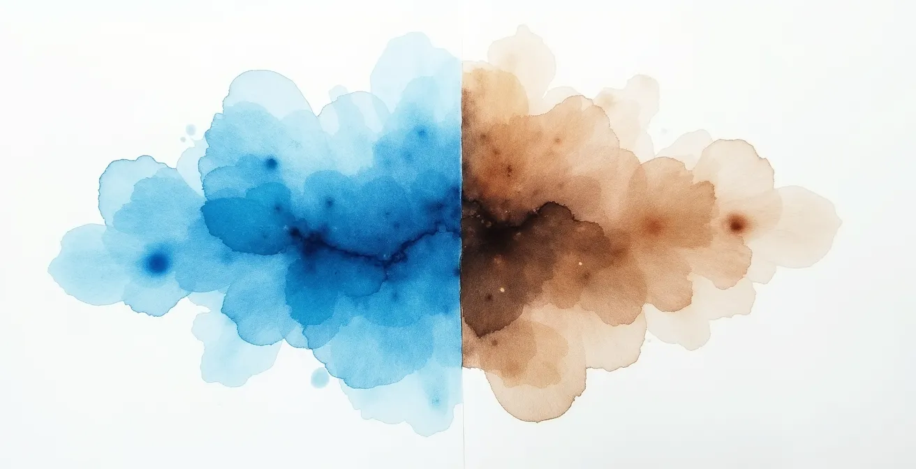
Opaque colors like Cadmium Yellow or Yellow Ochre have their place, but they should be used sparingly in wet-on-wet, often as a final touch on a damp or dry surface, not mixed into a wet wash. By respecting the transparency of your pigments, you allow light to do the work, creating depth and luminosity instead of mud.
This table helps clarify which pigment types are best suited for each stage of the wet-on-wet process. By understanding these properties, you can make intentional choices that build depth rather than create mud.
| Pigment Type | Transparency Level | Best Use in Wet-on-Wet |
|---|---|---|
| Staining Colors (Phthalo Blue) | Highly Transparent | First wash layer – dyes paper fibers |
| Granulating Colors (Ultramarine) | Semi-Transparent | Second layer – settles into texture |
| Non-Granulating Primaries | Transparent | Color mixing – maintains luminosity |
When to Add Details: The “Cold to Touch” Paper Test
One of the most common questions from beginners is, “When can I add the next layer?” Acting too soon results in colors bleeding uncontrollably. Waiting too long creates hard, unwanted edges. The answer doesn’t come from a stopwatch, but from your senses. Mastering wet-on-wet is about learning to read the paper’s moisture level through a “Sensory Clock” of sight, touch, and even sound.
There are three key stages of dampness, and each is right for a different type of mark. Understanding them is the key to control.
- Stage 1: The Mirror Sheen (Visual Test). Immediately after you lay down a wash, the paper will have a glossy, reflective surface. Artist Louise DeMasi beautifully describes this as looking like “a plump, juicy orange just after slicing it open.” At this stage, the paper is saturated. Dropping in new color will cause it to explode outwards, creating very soft, feathery blends. This is perfect for initial sky gradients or loose, atmospheric backgrounds.
- Stage 2: The Satin Sheen & “Cold to Touch” (Tactile Test). This is the magic window. The mirror-like gloss has faded to a subtle, satin sheen. The paper no longer looks wet, but if you hover your hand just above the surface, you’ll feel a distinct coolness. This is the ideal moment for adding soft-edged details like clouds, distant trees, or the gentle form of a shadow. The paint will spread slightly but will mostly “stay put,” giving you control over the shape while still achieving those beautiful, fuzzy edges characteristic of watercolor.
- Stage 3: The Dry Surface (Auditory Test). Once the cold feeling is gone, the paper is effectively dry. If you were to drag a clean, damp brush across it, you would hear a faint scratching sound. Any mark you make now will have a hard, crisp edge. This stage is for your final details: sharp tree branches, window panes, or the sparkle in an eye.
By tuning into this sensory feedback, you move from guessing to knowing. You are no longer just painting; you are actively engaged in a dialogue with the water, responding to its state to achieve your desired effect.
The Water Control Error That Causes “Cauliflower” Blooms
Every watercolorist has experienced it: you’re admiring a beautiful, smooth wash as it begins to dry, and then a drop of water from your brush or a too-wet mixture accidentally touches the surface. A moment later, a strange, feathery shape with dark edges appears, pushing the pigment away. This is a “bloom” or “backrun,” often called a “cauliflower,” and it’s one of the most common frustrations in wet-on-wet painting.
This isn’t a random accident; it’s a predictable outcome of a water imbalance. As a watercolor wash dries, the water evaporates and the pigment particles settle onto the paper. According to a visual troubleshooting guide on common failures, a bloom occurs when a new, more liquid bead of fluid is introduced into this settling wash. The excess water from the new drop flows outwards, pushing the already-settling pigment particles with it. When this outward flow stops, the displaced pigment is deposited at the edge, creating the characteristic dark outline.
The error is simple: your brush had more water than the spot on the paper it touched. This can happen when you rinse your brush and don’t blot it enough, or when you go back into a dampening wash with a fully loaded brush. But don’t despair; when you see a bloom forming, you can often rescue it with the “thirsty brush” technique.
Action Plan: The “Thirsty Brush” Rescue Technique
- Identify the Bloom Immediately: As noted by artist Susan Chiang, look for the “lifting or pushing away of paint that some call cauliflowers or backruns” as soon as it starts to form. Act quickly.
- Prepare Your “Thirsty Brush”: Quickly clean your brush and then blot it firmly on a paper towel or sponge. It should be just damp, not wet. It needs to be “thirstier” than the paper.
- Gently Wick Away Excess Water: Touch the very tip of your thirsty brush to the center of the forming bloom. Don’t scrub. The damp brush will act like a siphon, wicking away the excess water that is causing the bloom.
- Soften the Edges: Once the excess puddle is gone, you can use the same clean, damp brush to very gently soften the hard edges that may have started to form.
- Understand the Clock: This reaction is governed by what the renowned artist Joseph Zbukvic calls the “Watercolor Clock.” Recognizing the paper’s moisture level (the time on the clock) tells you what consistency of paint you can apply, preventing blooms in the first place.
Natural vs Synthetic: Do You Really Need Sable Hair for Landscapes?
The conversation around watercolor brushes is often dominated by a single, expensive word: Sable. For centuries, Kolinsky sable hair has been the gold standard, prized for its ability to hold a large amount of water and snap back to a fine point. But for a beginner learning wet-on-wet, is a $100 brush really necessary? The answer is no, and in some cases, a quality synthetic can be even better.
The most important factor in a wet-on-wet brush isn’t its price tag, but its water release pattern. This is where natural and synthetic brushes differ significantly. Natural sable hair tends to “dump” its water load quickly. When you touch it to the paper, a large puddle forms almost instantly. This is excellent for laying down a large, even, initial wash, but it can be difficult to control when you want to drop in smaller amounts of color precisely.
High-quality modern synthetic brushes, on the other hand, are engineered for a controlled, steady release. They don’t hold as much water as a sable mop, but they release what they do hold in a more predictable, even flow. This makes them far superior for the delicate work of dropping color into a damp wash to create soft clouds or distant hills. You have more control over how much water and pigment you’re adding, which directly helps prevent blooms and backruns.
For a beginner’s toolkit, a combination is ideal: a large synthetic or synthetic-blend mop brush for initial washes, and a smaller, size 8 or 10 round synthetic brush for dropping in color and creating soft-edged details. You don’t need a sable to create beautiful landscapes; you need the right tool for the job.
This comparison shows how different brush types release water, which dictates their best use in the wet-on-wet process. Choosing the right tool is about matching the release pattern to your artistic intention.
| Brush Type | Water Release Pattern | Best Application |
|---|---|---|
| Natural Sable | Quick dump – creates large puddle | Initial even wetting, large soft washes |
| Quality Synthetic | Controlled, steady release | Precision color dropping, detail work |
| Synthetic Mop | High capacity, gradual release | Background washes, sky gradients |
Why the Tactile Feel of Watercolor Grounds Your Technique?
In a digital world of screens and clicks, watercolor offers a refreshingly tangible experience. This is not an abstract process; it’s a physical one. The “Sensory Clock” we discussed earlier is rooted in this physicality. Mastering wet-on-wet is less about intellectual knowledge and more about developing a tactile intelligence. It’s about learning what a perfectly damp paper *feels* like through the hairs of your brush and the back of your hand.
Think about the process. You feel the satisfying weight of a water-loaded brush. You experience the subtle drag or glide as it moves across papers of different textures. You learn the precise pressure needed to make a mark without disturbing the layers beneath. This hands-on connection is what grounds you in the moment. When you are fully engaged with the physical sensations of painting, you are not overthinking; you are responding.
This tactile connection is also your best diagnostic tool. Does your brush feel too heavy and sloppy? It’s probably overloaded with water. Does it feel scratchy and dry against the paper? Your wash has dried, and you’re about to create a hard edge. By paying attention to these physical cues, you build an intuitive understanding that is far more reliable than any timer or abstract rule. This is the essence of the “moisture dialogue”—it’s a conversation that happens through touch.
Embrace this physicality. Take time to just make marks on paper. Feel how a thirsty brush lifts water. Notice the difference in temperature between a wet and a damp surface. This sensory exploration builds muscle memory and intuition. It transforms painting from a series of stressful decisions into a flowing, responsive, and deeply grounding practice.
Pans vs. Tubes: Which Paint Format Makes Wet-on-Wet Visuals Easier?
When setting up your palette, you face a primary choice: solid pans of dry paint or tubes of moist, paste-like paint. While both have their merits, for a beginner focused on the wet-on-wet technique, one format offers a distinct advantage in creating beautiful, flowing visuals more easily: tube paints.
The challenge with pans is getting a rich, concentrated puddle of color quickly. To do so, you must pre-wet the pans and scrub your brush into the solid cake to lift enough pigment. This can be slow and often results in a watery, less-saturated mixture, leading to weak, anemic washes. You also risk contaminating your pans with other colors from a dirty brush.
Tube paints, however, allow you to work like a traditional painter. You can squeeze out fresh, vibrant color directly onto a ceramic or plastic palette. This has two major benefits for wet-on-wet work:
- Rich Saturation on Demand: You can easily mix a large, pigment-rich puddle of color. This is essential for loading your brush for a bold, juicy initial wash. You get vibrant color from the very first stroke, which is key to a luminous painting.
- Clean, Controlled Mixing: With colors laid out on a palette, you can pull small amounts into a central mixing area, keeping your pure colors clean. It’s much easier to control the water-to-paint ratio in an open mixing well than on the surface of a tiny pan.
While pan sets are excellent for travel and quick sketching, investing in a small, introductory set of primary colors in tubes will make your studio practice significantly easier. It removes the barrier of lifting pigment and allows you to focus on the more important tasks: managing water on your paper and laying down beautiful, saturated washes.
Key takeaways
- Mastering wet-on-wet is a “moisture dialogue” based on sensory feedback, not just rules.
- The foundation is non-negotiable: 300 GSM, 100% cotton paper prevents buckling and ensures vibrant color.
- Timing is everything. Use the “Sensory Clock” (sheen, coldness, sound) to know when to apply layers for controlled, soft edges.
How to Use Wet-on-Wet to Express Mood and Emotion (Not Just Mud)
We’ve focused intensely on the technical—the right paper, the right pigments, the right timing. But the goal of all this control is, paradoxically, to let go and express something. The wet-on-wet technique, once you are comfortable with the moisture dialogue, is the most powerful tool in a watercolorist’s arsenal for conveying mood and emotion.
Think about what the technique excels at: soft edges, gradual transitions, and atmospheric effects. These are the visual languages of emotion. A misty, foggy morning is not defined by sharp lines, but by soft, grayed-out shapes bleeding into one another. The fiery glow of a sunset is a seamless gradient from orange to purple. The feeling of a dream or a memory is hazy and indistinct. These are effects that are nearly impossible to achieve with the hard-edged precision of wet-on-dry painting.
Once you stop fighting the water and start collaborating with it, you can use these properties intentionally. To create a moody, somber landscape, you can work on a very wet surface, letting dark, granulating pigments flow and settle in unpredictable, organic ways. To capture a feeling of bright, joyful light, you can use highly transparent, staining colors on a damp surface, allowing their luminosity to shine through. The level of moisture on your paper becomes a dial for emotional intensity, from the explosive energy of a wet-in-wet splash to the quiet contemplation of a soft glaze on a damp surface.
This is the ultimate payoff. All the practice of learning the “Sensory Clock” and understanding water control liberates you. You are no longer just trying to avoid making mud. You are a conductor, orchestrating the flow of water and pigment to create a symphony of light, atmosphere, and feeling. Your technical skill serves your artistic vision, allowing you to translate the emotions in your head and heart onto the paper.
Now that you understand the dialogue between water, paper, and pigment, the next step is to start the conversation yourself. Begin your practice not with the goal of creating a masterpiece, but with the simple intention of listening to your materials.